

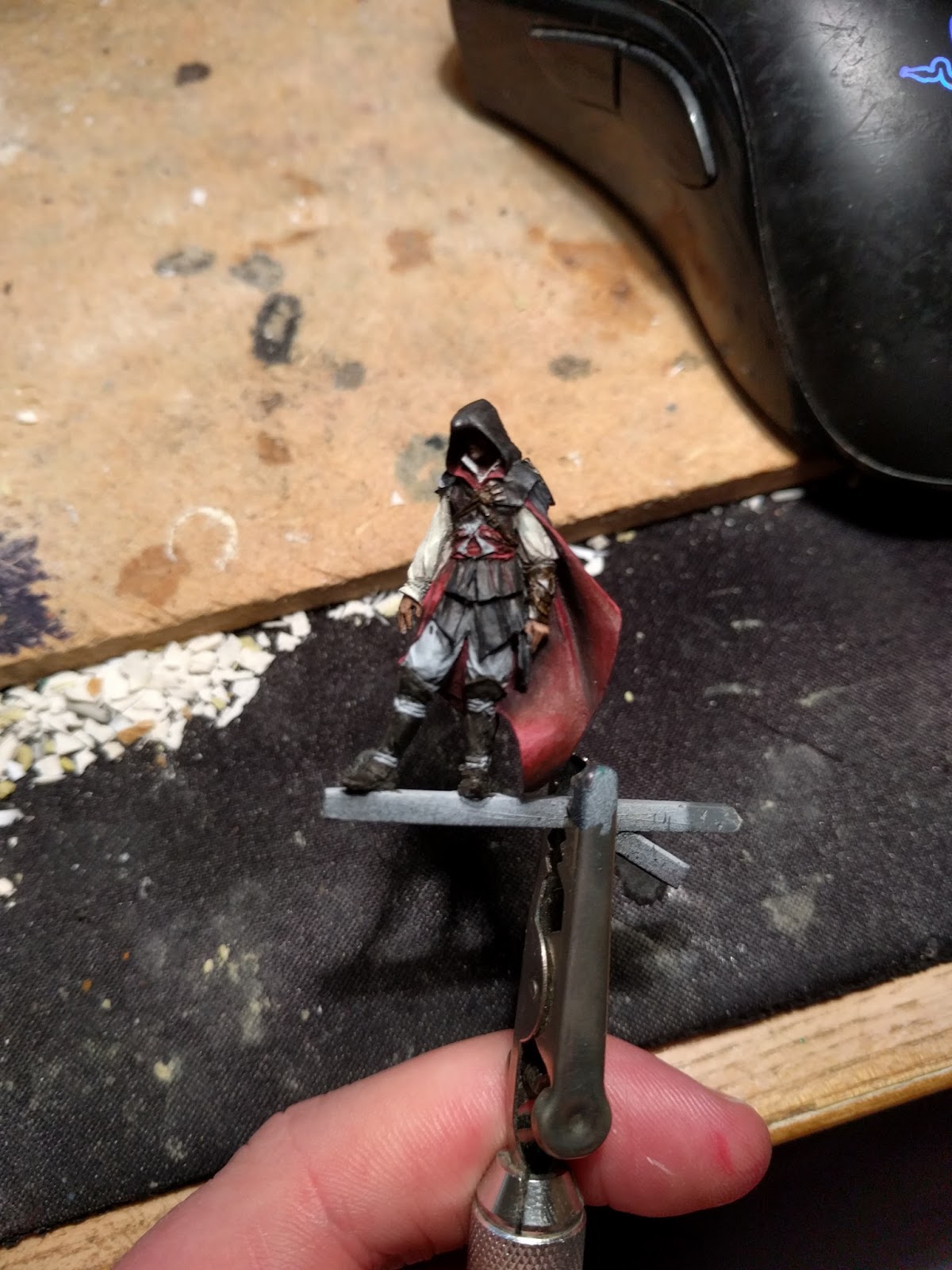
Back with the assassin again this week. First let's have a refresh of where we were up to:

I used Vallejo Smoke mixed
with a little black on the leather parts (boots, bracer, various
straps around the chest and his shoulder piece) I also started
working on the contrast of the cloak by working cold blue into the
red base coat and bringing the shadows in. Likewise on the other red
areas of the model.

Next I continued bringing other base colours in so I can see how the
overall composition looks. The shirt was painted with Vallejo Pale
Sand with a little Vallejo Leather Brown mixed in to give some
shadows.


Contrast, contrast, contrast. Brighter red (Reaper Blood Red) were
glazed into the cloak and other red areas to help increase the
contrast. I mixed some white into the Pale Sand and highlighted the
shirt as well.

I also started working on the outer side of the cloak, using Field
Blue mixed into the base coat in increasing quantities worked into
the highest areas.

MORE contrast. You can never have too much. Someone told me once that
go until you think the contrast is right and then push it a couple of
notches more :D I mixed in a little flesh tone to the Blood Red and
used it to push the highlights around the model. This really helps
emphasise the folds in the belt and the billowing cloak. Red is
tricky to highlight. If you add white it looks pink, if you add
yellow or orange it looks orange. Adding flesh tones can give a more
natural highlight but it might need a red glaze over the top later.
Next week more contrast likely! Also trousers, metals and detail work
on the black robes.