
I finished Part 1 by hinting at what was coming next with his green shirt, so that's where we'll begin.


Instead of painting both greens the same way, I split them in two. The first set of greens, on the back of his coat and shoulders, I left with just Boreal Green for now. This is the colour of the armour plating in my new Guard scheme, so I decided to keep this to tie him to the force. The second, more prominent green I decided would be a separate shade, to show his separation from the command structure.
I made this green warmer by washing it with a mix of S75's Inktense Chestnut wash and a tiny amount of S75 Ardennes Green

To add a little more contrast, I added more wash to the sash at his belt and also into the shadows of his top. I followed this up with a light highlight of S75 Sherwood Green.


While painting up the green, I started work on the Power Sword blade. I've been thinking about trying out the whole glaze power weapon effect for quite a while, so decided to experiment.
I started out with just a GW Fenris Grey layer. I initially started light, as I decided that it would give me a lot of space for adding shade and tones.

This was followed initially by watered down layers of GW's Guilliman Blue glaze to provide a blue tone.
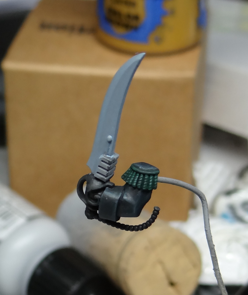


I decided that this wasn't quite bold enough, so I added in a drop or two of S75 Inktense Blue. Skipping ahead a few layers, this has added quite a rich tone to the blade. After the Inktense Blue, I added a tiny amount of Inktense Purple to the mix, before bringing the edges back to Fenris Grey and adding some P3 Morrow White to the tip.


To give an idea of the contrast, I took some greyscale shots. What these show is that while my glazing is a little rushed (need more practice and patience), there is a nice tone shift across the blade.


Once I'd got the blade as I wanted it, I moved focus onto the base. I created a few rough layers through a combo of the darkest grey I had on my desk and a mid tone grey that was easy to hand - in this case it was S75 Necro Grey and Vallejo grey primer.

I added a lighter tone with some stippling, again mixing the two above tones.

A wash of Inktense Chestnut and GW Nuln Oil was added into the cracks.

Once the rim was painted black, the stippled highlights started to pop a little more.


That's it for this week - next week I'll be working on the metals and maybe a flesh tone or two. I may even have a finished piece for you :)